Two Twenty
Two Twenty
Creating visual stories that connect and stay
Creating visual stories that connect and stay
Architecting endurance in an era of ephemeral content.
Architecting endurance in an era of ephemeral content.
Video production companies have a numbers problem. Millions of hours uploaded every day, CPMs falling, attention windows shrinking. The industry's answer has been velocity: more content, faster, cheaper. Two Twenty's answer was the opposite.
Video production companies have a numbers problem. Millions of hours uploaded every day, CPMs falling, attention windows shrinking. The industry's answer has been velocity: more content, faster, cheaper. Two Twenty's answer was the opposite.
They came to us as a studio that already knew what kind of work they wanted to make. The brief wasn't about finding a direction. It was about building an identity worthy of the conviction they already had. Our task was to make sure the brand could hold the same weight as the films.
They came to us as a studio that already knew what kind of work they wanted to make. The brief wasn't about finding a direction. It was about building an identity worthy of the conviction they already had. Our task was to make sure the brand could hold the same weight as the films.
A visual identity defined by cinematic restraint.
A visual identity defined by cinematic restraint.
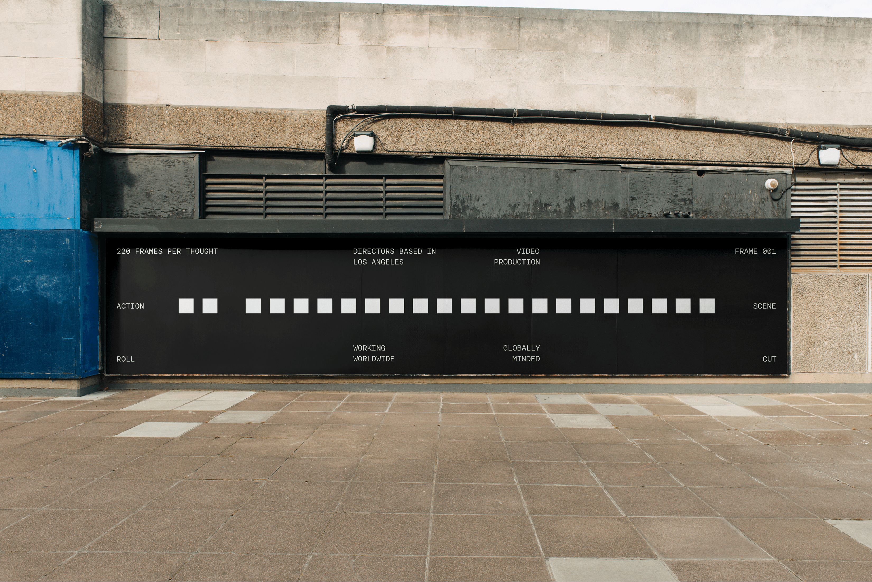
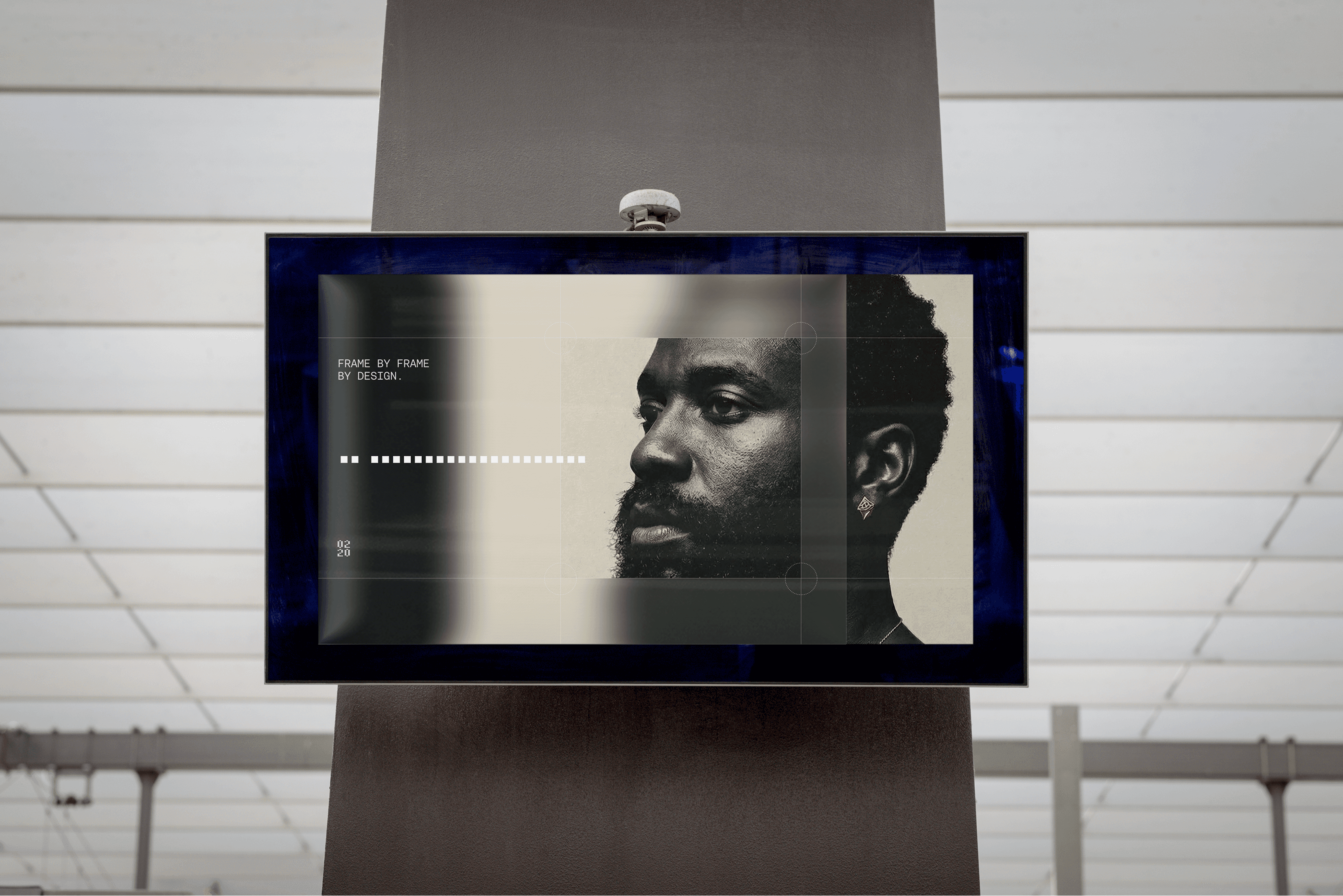
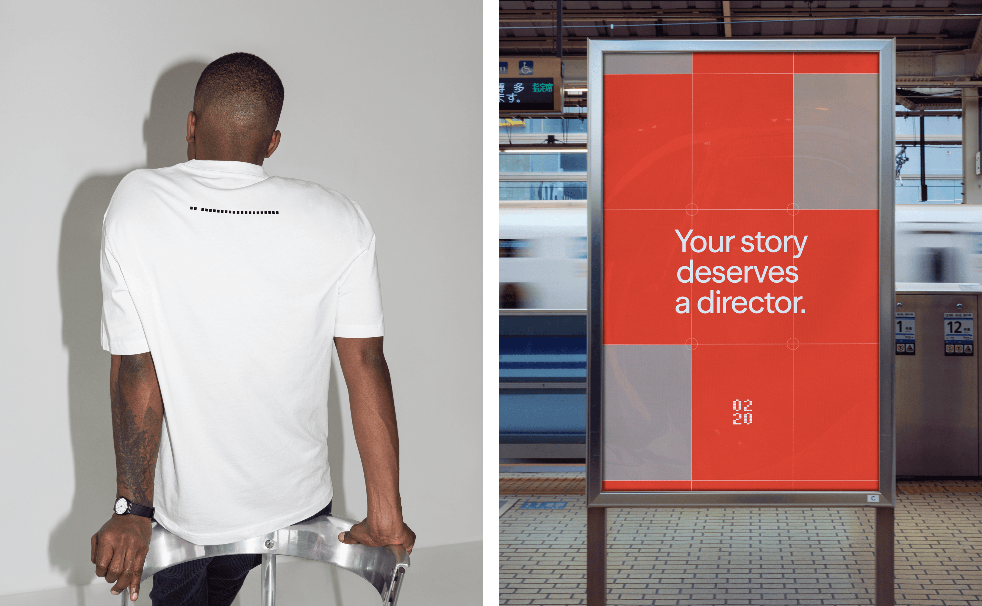
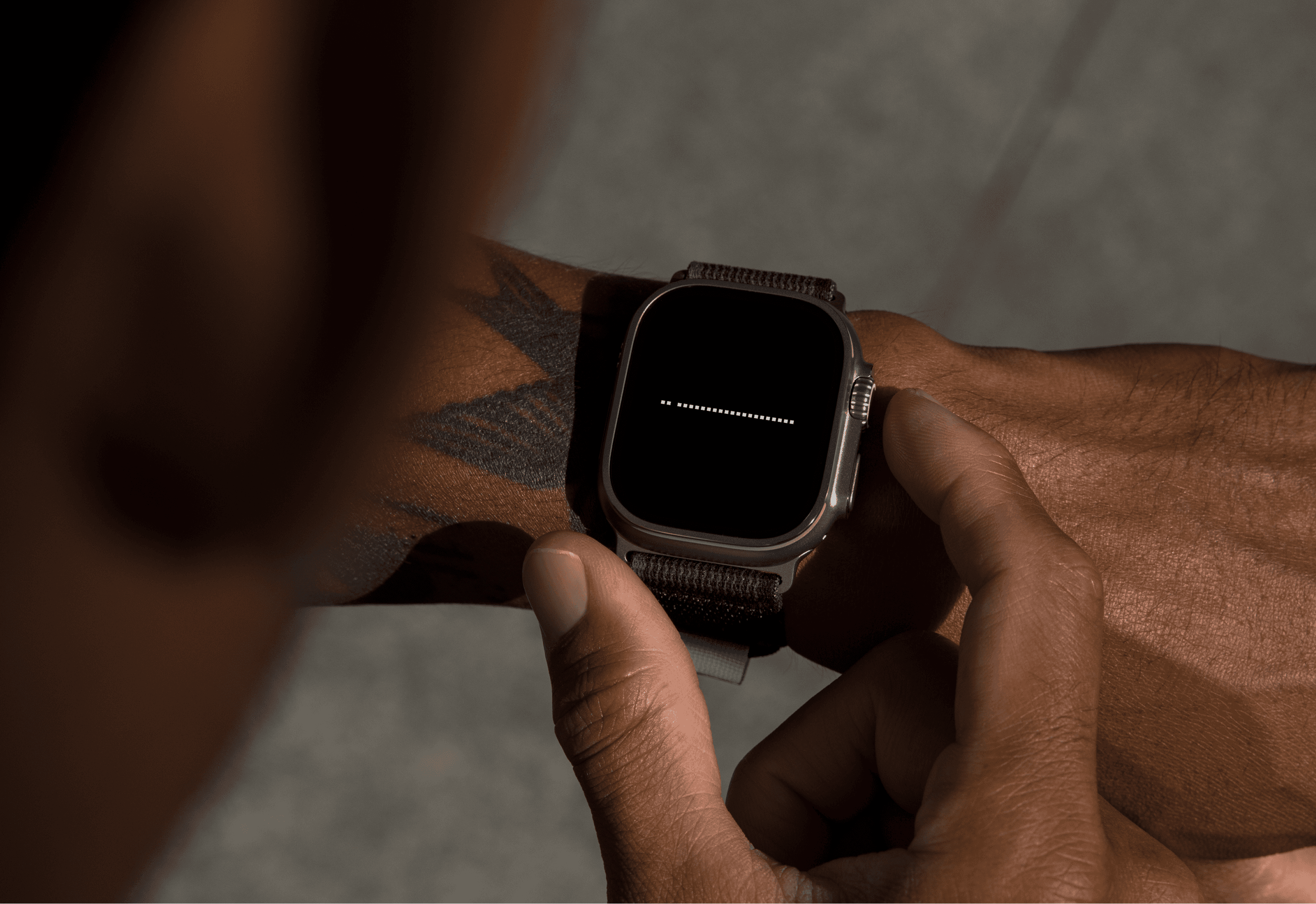
The identity is built around what we called the director's cut logic: everything that doesn't serve the story gets removed. The typographic system uses high-contrast letterforms with the authority of a title card, set with the kind of precise spacing that cinematographers apply to frame composition. Nothing decorative. Nothing that earns its place through loudness.
The identity is built around what we called the director's cut logic: everything that doesn't serve the story gets removed. The typographic system uses high-contrast letterforms with the authority of a title card, set with the kind of precise spacing that cinematographers apply to frame composition. Nothing decorative. Nothing that earns its place through loudness.
The palette came from the working hours of film production: the hour before sunrise on location, the cold blue of a grading suite at 2am. Calibrated, specific. Colors chosen not for mood boarding but for what they actually communicate about how this studio operates.
The palette came from the working hours of film production: the hour before sunrise on location, the cold blue of a grading suite at 2am. Calibrated, specific. Colors chosen not for mood boarding but for what they actually communicate about how this studio operates.
Translating the rhythm of narrative into a dynamic system.
Translating the rhythm of narrative into a dynamic system.
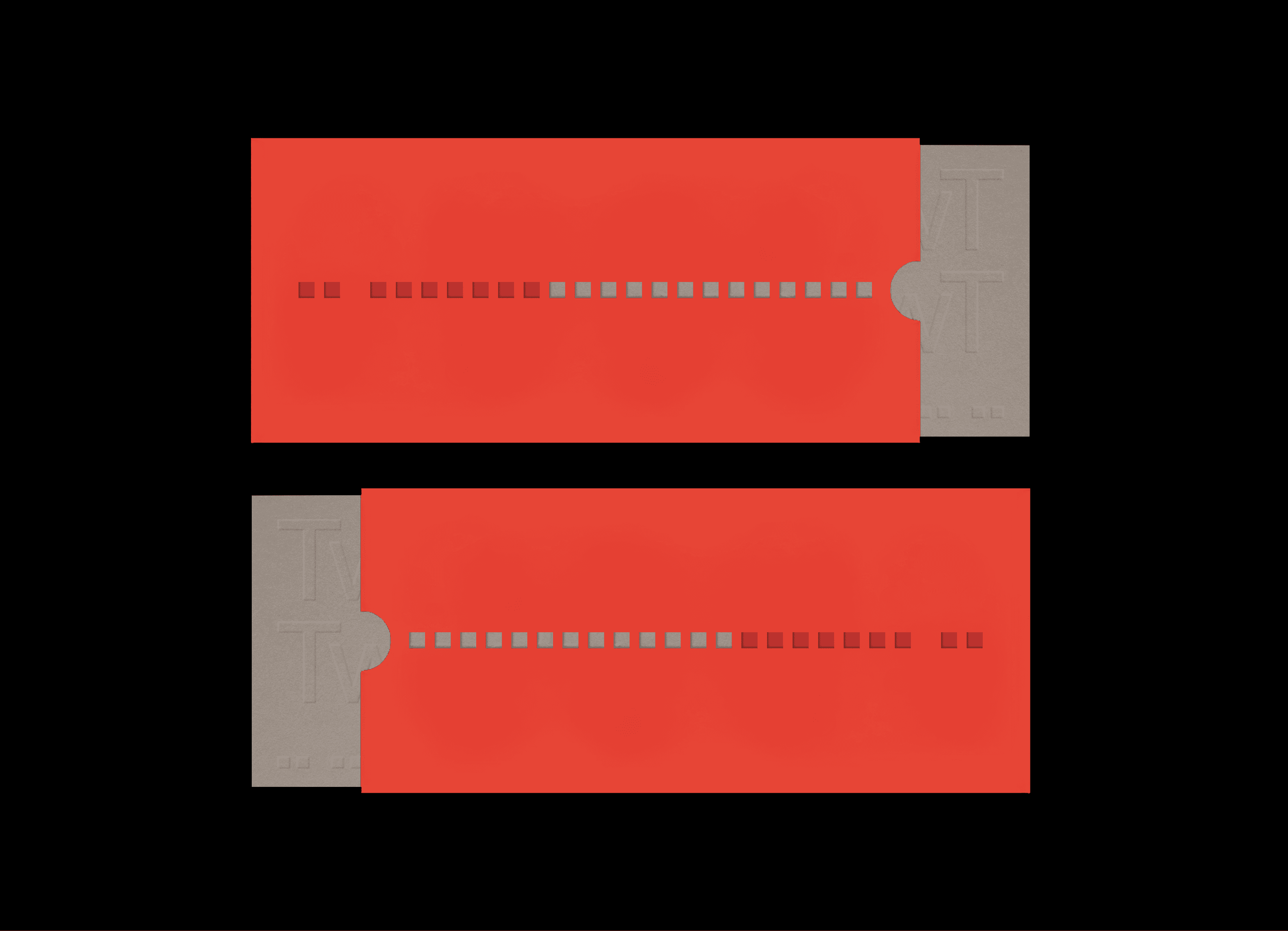
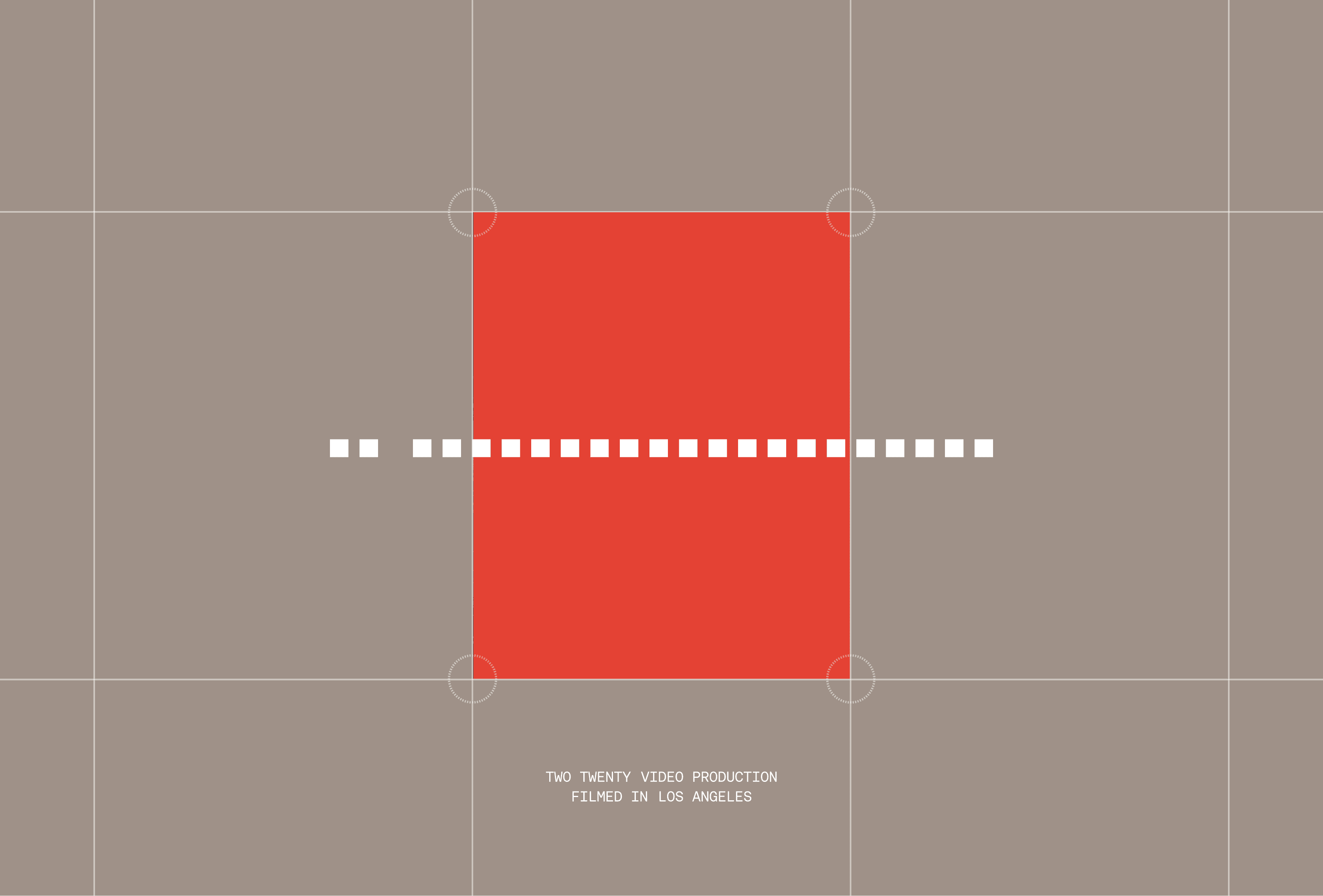
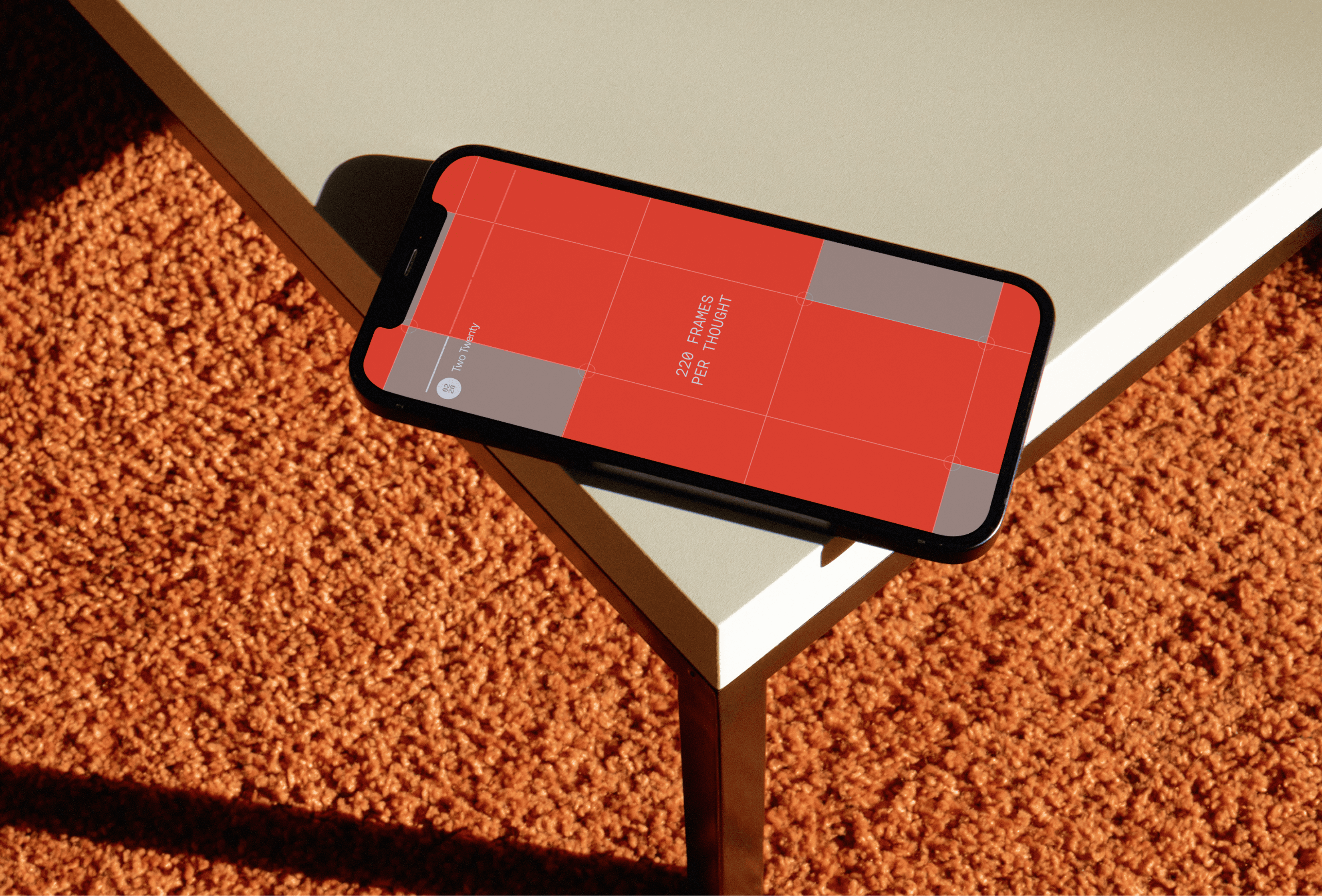
Static brand systems break when applied to a company whose primary output moves. We built the motion design framework first, not last. Transitions that read as cuts. Load states that feel like a camera finding focus.
Static brand systems break when applied to a company whose primary output moves. We built the motion design framework first, not last. Transitions that read as cuts. Load states that feel like a camera finding focus.
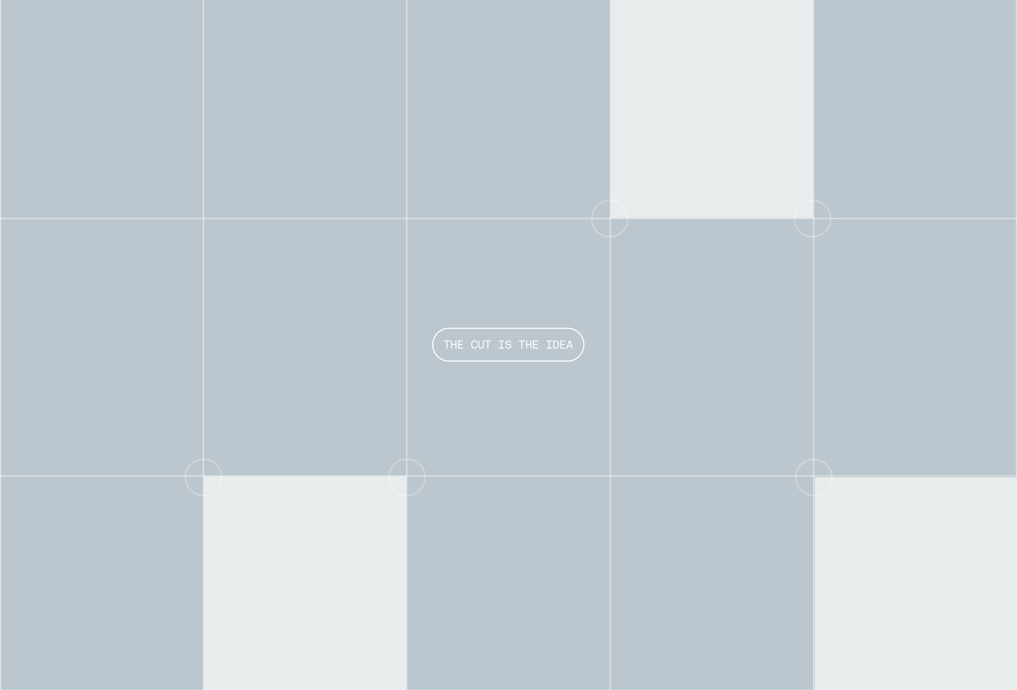
The grid structure loosens in certain layouts by design: the rigidity of a production schedule is already present in how the studio operates. The brand doesn't need to perform that discipline. It can afford to breathe.
The grid structure loosens in certain layouts by design: the rigidity of a production schedule is already present in how the studio operates. The brand doesn't need to perform that discipline. It can afford to breathe.
Stories shape how brands are remembered.
Stories shape how brands are remembered.
Two Twenty's clients aren't buying deliverables. They're buying the difference between content that gets consumed and content that gets remembered. That's a harder sell than a reel. The brand needed language and visual logic that made that case without overstating it.
Two Twenty's clients aren't buying deliverables. They're buying the difference between content that gets consumed and content that gets remembered. That's a harder sell than a reel. The brand needed language and visual logic that made that case without overstating it.
The result is an identity that operates the way Two Twenty's films do: with confidence in the edit, trust in the negative space, and the understanding that what you leave out is as important as what you include.
The result is an identity that operates the way Two Twenty's films do: with confidence in the edit, trust in the negative space, and the understanding that what you leave out is as important as what you include.
Most video is forgotten within 48 hours of being watched. Not because audiences are distracted, but because most of it was never built to last. It was built to perform, to hit a metric, fill a calendar slot, satisfy a brief. The infrastructure of modern content production optimizes for output. Two Twenty optimizes for something harder to measure.
Founded on the conviction that film is still the most powerful medium for shaping how a company is understood, Two Twenty works with clients who have outgrown the production studio model. Not because they need more equipment or a bigger crew, but because they need a collaborator who treats every project as a directorial decision, not a deliverable.
STALA was brought in to build the brand from the ground up: strategy, identity, voice, and creative direction.
The question we kept returning to was this: what does craft actually look like when it's not performing craft? Two Twenty's films don't announce their own quality. They earn attention through restraint, through the specific detail that cheaper work leaves out, through the edit that knows when to hold and when to cut. The brand needed to operate the same way.
So we built an identity that doesn't explain itself. Typography drawn from the precision of a title card. A palette sourced from the working hours of production; not the glamour of it, but the discipline. Motion logic that mirrors how their films actually move. A voice that is direct without being cold, confident without being loud.
The result is a brand that attracts the kind of client Two Twenty was already making work for: people who understand that the difference between content and film is the same as the difference between noise and signal.
Year
Year
2026
2026
Scope
Scope
" height="420.7060844560808px" id="vAF1GXtUa" width="1614.4210925226776px"/></svg>)